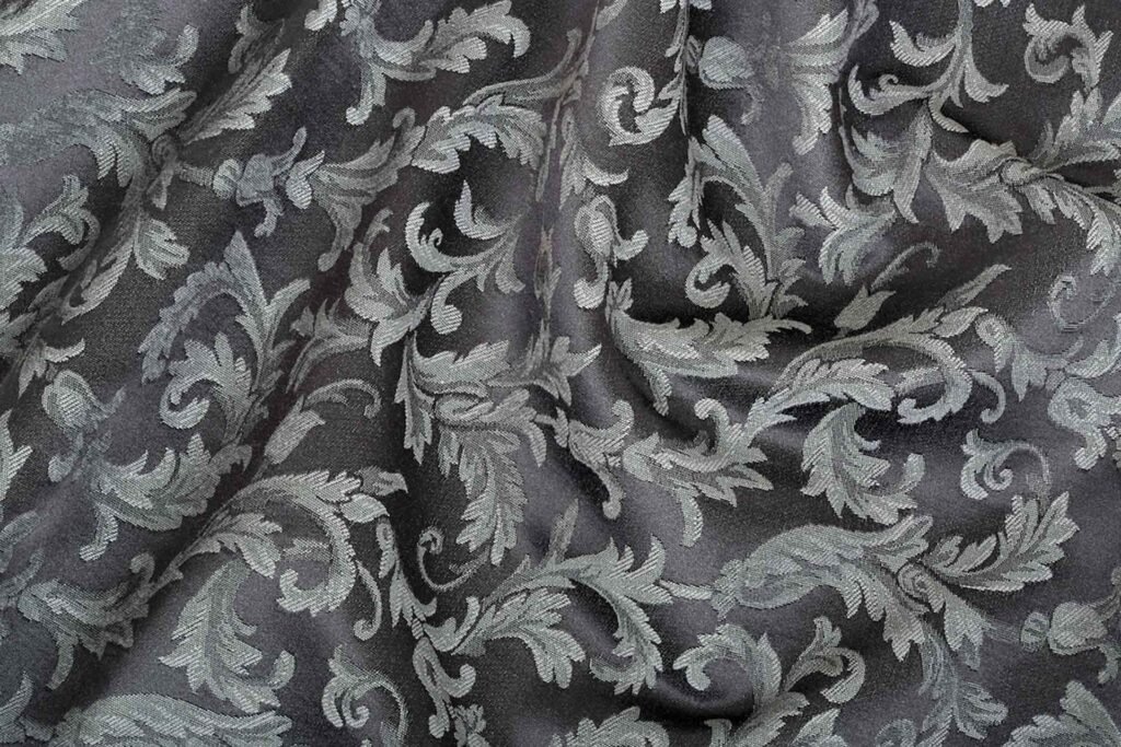
Walk into a hotel lobby, a Victorian townhouse, or a contemporary design-forward apartment, and you'll find damask. The patterns change in color and scale, but the underlying vocabulary — the curved leaf, the symmetrical flower, the stylized pomegranate — stays remarkably consistent. Nobody decided to preserve these motifs. They survived because they work, and they work for reasons that go deeper than taste or tradition.
This is an attempt to explain why.
The Motifs Themselves: Where They Came From
The three motifs that define classical damask — the Damascus rose, the palmette, and the pomegranate — didn't originate as decorative choices. They arrived via the Silk Road as cultural symbols that happened to translate unusually well into woven fabric.
The Damascus rose entered European textile vocabulary through Syrian and Persian weaving traditions, where the stylized multi-petaled flower had already been refined over centuries. What made it travel so well wasn't its symbolic meaning — it was its structure. A rose drawn in the damask convention is never botanically accurate. It's a radially symmetrical form built from concentric curves, radiating outward from a central point. That geometry is almost perfectly suited to satin-weave construction, for reasons we'll get to shortly.
The palmette — the fan-shaped, palm-leaf derived form that appears in virtually every classical damask border and repeat — has an even older lineage. Versions of it appear in ancient Egyptian, Assyrian, and Greek decorative arts. By the time it reached Islamic textile production, it had been abstracted into a form so geometrically clean that it could be woven with a precision that more naturalistic shapes couldn't achieve.
The pomegranate motif — a crowned, bulbous form enclosing smaller decorative elements — became the dominant damask pattern in 15th and 16th century Italian and Spanish silk weaving. It was aspirational: the pomegranate symbolized abundance and fertility, and wearing or displaying it was a statement of status. But again, its persistence wasn't purely symbolic. The pomegranate's form — a rounded outer contour with internally nested smaller shapes — creates a repeat that tiles predictably across a fabric width, which has significant practical advantages in production.
All three motifs share a common structural feature: bilateral symmetry built from curves. That's not a coincidence.
palmette Damask
Why Curves Work Better Than Straight Lines in Satin Weave
This is the part nobody explains, and it's the key to understanding why damask patterns look the way they do.
In a satin weave, threads float over multiple others before interlacing. Those floats are what create the sheen — the more thread surface exposed uninterrupted, the more light reflects evenly, the brighter the area appears. The pattern in damask is created by the contrast between areas where the warp floats (the motif) and areas where the weft floats (the background), or vice versa.
Here's what matters: a float travels in one direction. Warp floats run vertically. Weft floats run horizontally. The loom can only create these two orientations of uninterrupted thread surface.
Straight-line designs — hard diagonals, sharp geometric angles, precise horizontal or vertical edges — work with or against these float directions in ways that can create optical jaggedness. A perfectly diagonal line in a satin weave is actually a staircase of tiny thread-width steps. At normal viewing distance, this creates a slightly ragged edge rather than a clean one.
Curves behave differently. A curve in a damask design is, at the thread level, a series of these same staircase steps — but because the direction is continuously changing, the steps are distributed around the curve rather than accumulating along a single edge. The eye reads this as smooth. The jaggedness is statistically distributed and perceptually averaged out. Tighter curves in smaller-scale designs can look slightly jagged, which is why classical damask motifs tend toward gentle, generous curves rather than tight spirals or sharp bends.
This is why a rose works and a geometric star often doesn't, at least not at the same scale. The rose's gradual curves distribute the staircase effect invisibly. The star's sharp points concentrate it at the tips, creating visible stepping.
Bilateral symmetry reinforces this further. When a curve appears mirrored on both sides of an axis, any minor imperfection in one side is visually counteracted by its mirror. The eye reads the pair as precise, even when individual threads are slightly misaligned. This is why damask patterns are almost universally symmetrical — it's not an aesthetic preference, it's optical error correction built into the design.
The Repeat: Why Size Isn't Just a Style Choice
Every woven pattern has a repeat — the unit that tiles across and down the fabric to fill the width. In damask, the repeat size has significant practical consequences that most buyers don't consider.
Small repeat (under 4 inches): The pattern completes itself within a small area. This means that when the fabric is cut and sewn, the pattern almost always appears consistent regardless of where the cut falls — there's no 'match' to manage. Small repeats also read as texture rather than pattern from normal viewing distance, which is why they work well for upholstery. A chair seat covered in small-repeat damask looks refined without competing with other patterns in the room. The pattern is something you notice when you sit close, not something that asserts itself from across the room.
There's a structural reason small repeats work for upholstery beyond aesthetics: upholstery fabric is cut into irregular pieces that follow the contours of furniture, and it's pulled taut across curved surfaces. A large-repeat pattern stretched over a seat cushion and wrapped around the sides will have the repeat distorted and interrupted in ways that look accidental. A small repeat is more forgiving of these cuts and tensions.
Medium repeat (4 to 12 inches): The most versatile range. Medium-repeat damask works for cushions, bed linens, and shorter curtain panels. It reads as pattern from a normal room distance but doesn't overwhelm. Most of the damask you see in mid-market home furnishing falls in this range.
Large repeat (12 inches and above): This is where damask becomes genuinely dramatic. Floor-length drapery is the natural home for large-repeat damask, and the reason is architectural: a full repeat needs vertical space to resolve itself visually. A 16-inch repeat on a 96-inch curtain panel completes itself six times from rod to hem — a satisfying rhythm. The same repeat on a 24-inch seat cushion is interrupted after less than two full cycles, which reads as arbitrary rather than intentional.
Large-repeat damask also plays differently with light than small-repeat versions. Because the satin float areas are larger, they catch and shift light more dramatically as curtains move. This is the quality that makes large-repeat silk damask drapes look alive — they're not just filtering light, they're responding to it.
The practical rule: match your repeat size to the scale of the application and the viewing distance. Upholstery is seen at 18 inches; a 3-inch repeat is plenty. Curtains are seen from 10 feet away; a 3-inch repeat reads as texture, not pattern, and loses its impact.
How Modern Designers Are Breaking the Rules (And Which Rules They're Actually Keeping)
The contemporary design world has done interesting things with damask over the past two decades — not abandoning it, but restructuring it in ways that reveal which of its properties are essential and which were just historical habit.
Scale amplification is the most common intervention. Designers like Fornasetti and studios working in maximalist interiors have taken classical damask motifs and blown them to extreme scale — repeats of 24, 36, even 48 inches. At this scale, the individual motif becomes architectural rather than decorative. A wall of oversized damask wallcovering doesn't read as pattern; it reads as texture with incident, the way stone masonry does. The motif is still recognizably damask — the curves, the symmetry, the nested forms — but its relationship to the room has fundamentally changed.
Color inversion and monochrome reduction is another recurring move. Classical damask relied on value contrast: a deep ground with a lighter motif, or vice versa. Contemporary versions often collapse this to near-zero contrast — an off-white motif on an ivory ground, or charcoal on black. The pattern becomes something you sense rather than see, visible only under raking light or at close range. This is technically demanding to produce (the weave contrast has to carry all the visual work without any color assistance) and it rewards attention in a way that high-contrast versions don't. It also photographs very differently from traditional damask, which partly explains its popularity in design-forward contexts.
Asymmetric and deconstructed repeats represent the most radical departure. Some contemporary textile designers have taken the classical motifs and offset them, rotated them, or allowed them to bleed off the edge of the repeat in ways that traditional production would have considered errors. The result is a damask that implies the classical vocabulary without reproducing it — the eye recognizes the curves and bilateral symmetry as familiar but can't quite resolve them into the expected pattern. This works better in wallcovering and statement upholstery than in fabric sold by the yard, because it requires intentional placement to read correctly.
What none of these interventions abandon is the fundamental principle: curves, symmetry, and the contrast between float areas. You can change the scale, the color, the repeat structure, the historical reference — but if you remove the curves or destroy the symmetry entirely, it stops reading as damask. The visual grammar is more durable than any specific motif.
Choosing Pattern Scale for Your Space: A Practical Framework
This is where the theory becomes actionable. The key variable isn't room size alone — it's the relationship between ceiling height, viewing distance, and the dominant furniture scale.
For curtains and drapery, the calculation starts with ceiling height. A useful baseline: your repeat size should be roughly 1/6 to 1/8 of the finished curtain drop. For a standard 96-inch drop, that's a 12–16 inch repeat. For a more dramatic 120-inch drop in a room with high ceilings, a 16–20 inch repeat is appropriate. Go smaller and the pattern gets busy; go larger and the repeat doesn't complete enough times to establish rhythm.
For upholstery, the key constraint is the largest uninterrupted flat surface on the piece. For a standard sofa seat cushion (roughly 24 inches wide), a repeat larger than 8 inches will be interrupted at the cushion edges in a way that looks accidental. For a large ottoman or a generously scaled chair back, a 10–12 inch repeat can work. For dining chair seats and small accent chairs, keep it under 4 inches.
For bedding, the governing surface is the bed face — the duvet cover or coverlet as seen from the foot of the bed. A king-sized bed face is roughly 108 inches wide; a 12–18 inch repeat tiles attractively across that width. Twin bedding with an 18-inch repeat will have only 4–5 full repeats across the width, which can look sparse. Scale down to 8–10 inches for smaller beds.
The ceiling height modifier: in rooms with ceilings under 8 feet, large-repeat patterns — anywhere — tend to make the space feel compressed rather than rich. The pattern asserts itself before the room has enough vertical space to contextualize it. In these rooms, medium-repeat damask (4–8 inches) gives you the visual interest without the oppressive effect.
The mixing rule: damask patterns can coexist with other patterns in a room, but the scale relationships matter. As a general principle, any second pattern in the space should be either much smaller (less than 1/3 the repeat size of the damask) or completely different in character (a stripe, a plain texture). Two similarly scaled damask patterns in the same room fight for the eye's attention without creating dialogue.
Why the Patterns Aren't Going Anywhere
The Damascus rose and the palmette have outlasted every design movement of the past five centuries — Baroque, Rococo, Neoclassicism, Art Nouveau, Modernism, Postmodernism, Minimalism. That kind of persistence is unusual in decorative arts and worth taking seriously.
Part of the explanation is cultural inertia: these patterns became so associated with quality and formality that they carry those associations forward regardless of the specific design moment. But cultural inertia alone doesn't explain survival through Modernism, which aggressively rejected historical ornament.
The deeper explanation is structural. These patterns work with the loom rather than against it. Their curves suit the satin weave's float structure. Their symmetry corrects for the limitations of thread-level precision. Their nested forms create compelling repeat tiles. They aren't just beautiful — they're well-engineered for their medium in a way that most decorative patterns aren't.
Modern designers who deform and amplify these patterns are working with this grammar even when they're subverting it. They know what they're departing from, and the departure is readable as departure only because the original is still legible underneath.
That's what it means for a visual vocabulary to survive: not that it goes unchanged, but that it remains the reference point against which everything else is measured.


